Sunrise Soya Foods – Brand Book
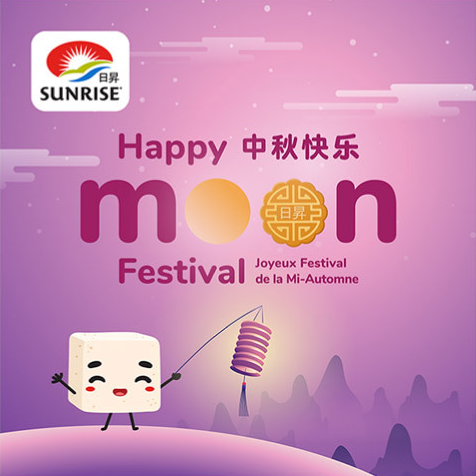
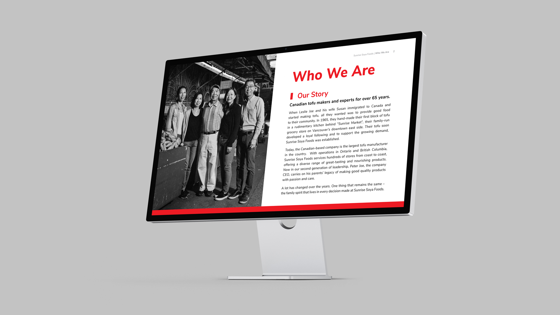
Sunrise Soya Foods (SSF) is a popular tofu brand committed to providing the best high-quality traditional and innovative non-GMO tofu and soy products. Their commitment is to knowing families have made healthy, wholesome and delicious choices when buying Sunrise Soya Foods products! SSF has grown to become one of Canada’s leading tofu manufacturers, producing only the highest quality non-GMO tofu products.
Brand Book
The SSF brand produces a wide variety of soy-based products. Their goal is to keep their future products and designs consistent when they reach their desired customers and consumers, as defined by their brand pillars in the brand book. With our help, SSF can define their branding to ensure consistency in future soy-based product packaging, advertising and documentation; all to exhibit their commitment to quality and fulfil their vision of “tofu in every fridge.”
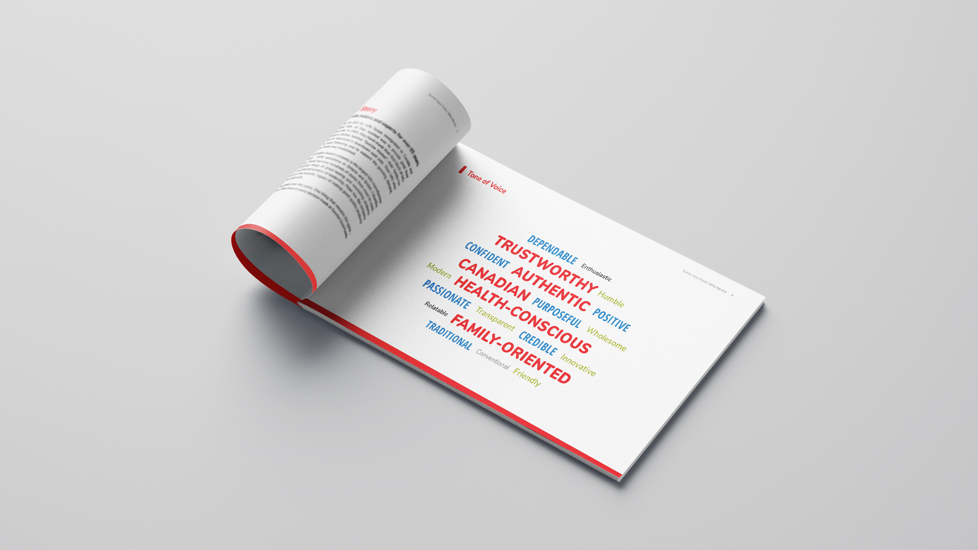
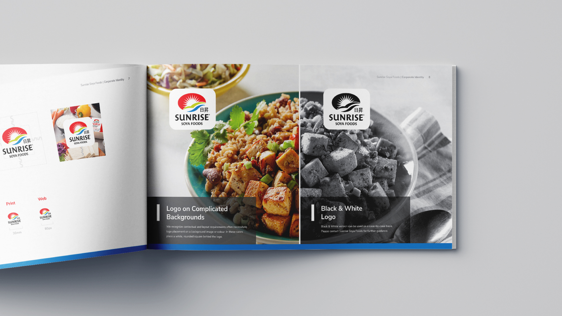
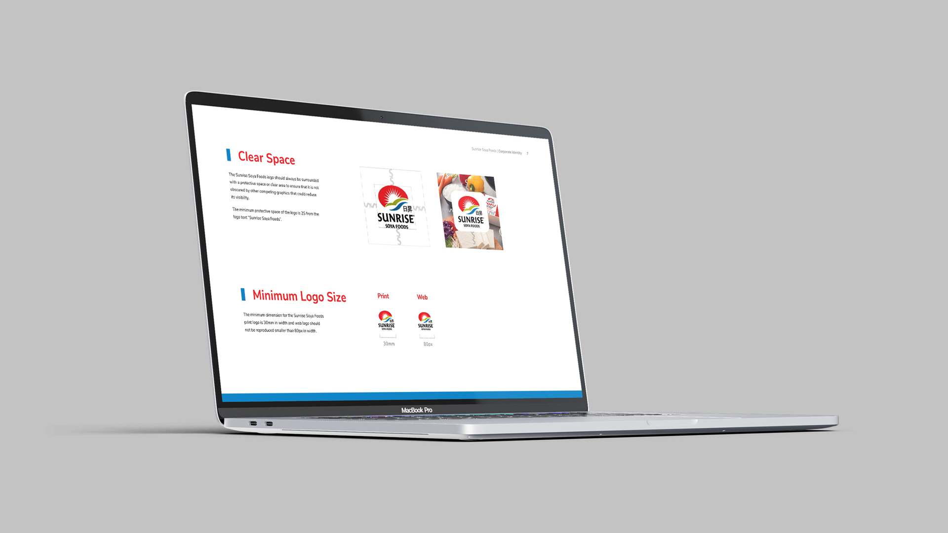
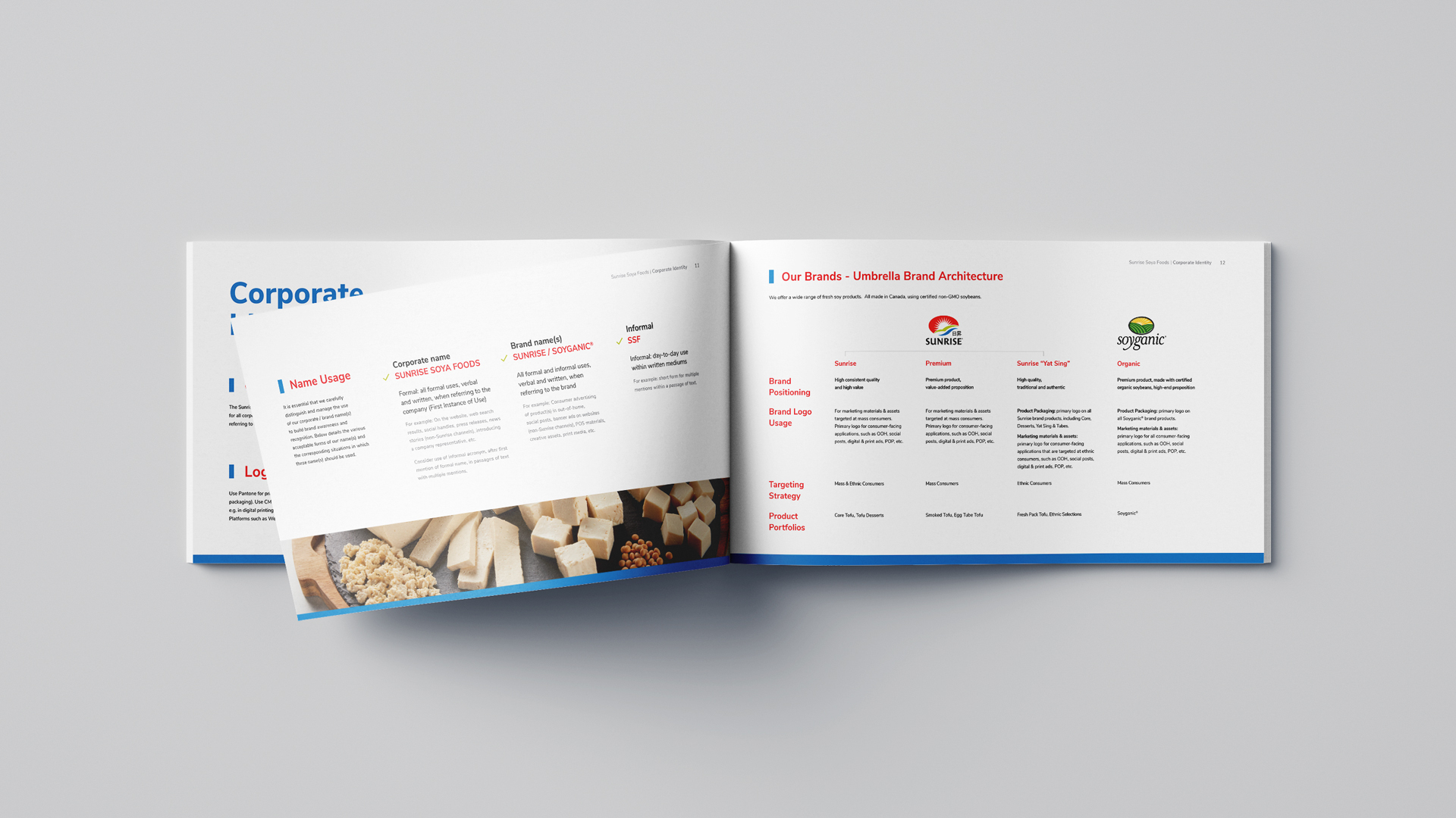
We categorized the information in the brand book to indicate the corporate identity (tone of voice, logo usage and colour), packaging design (of all categories of products), and typography sections. Each section uses a colour-coded bar across the bottom of each page using the SSF brand colour scheme (red, green and blue).
Packaging
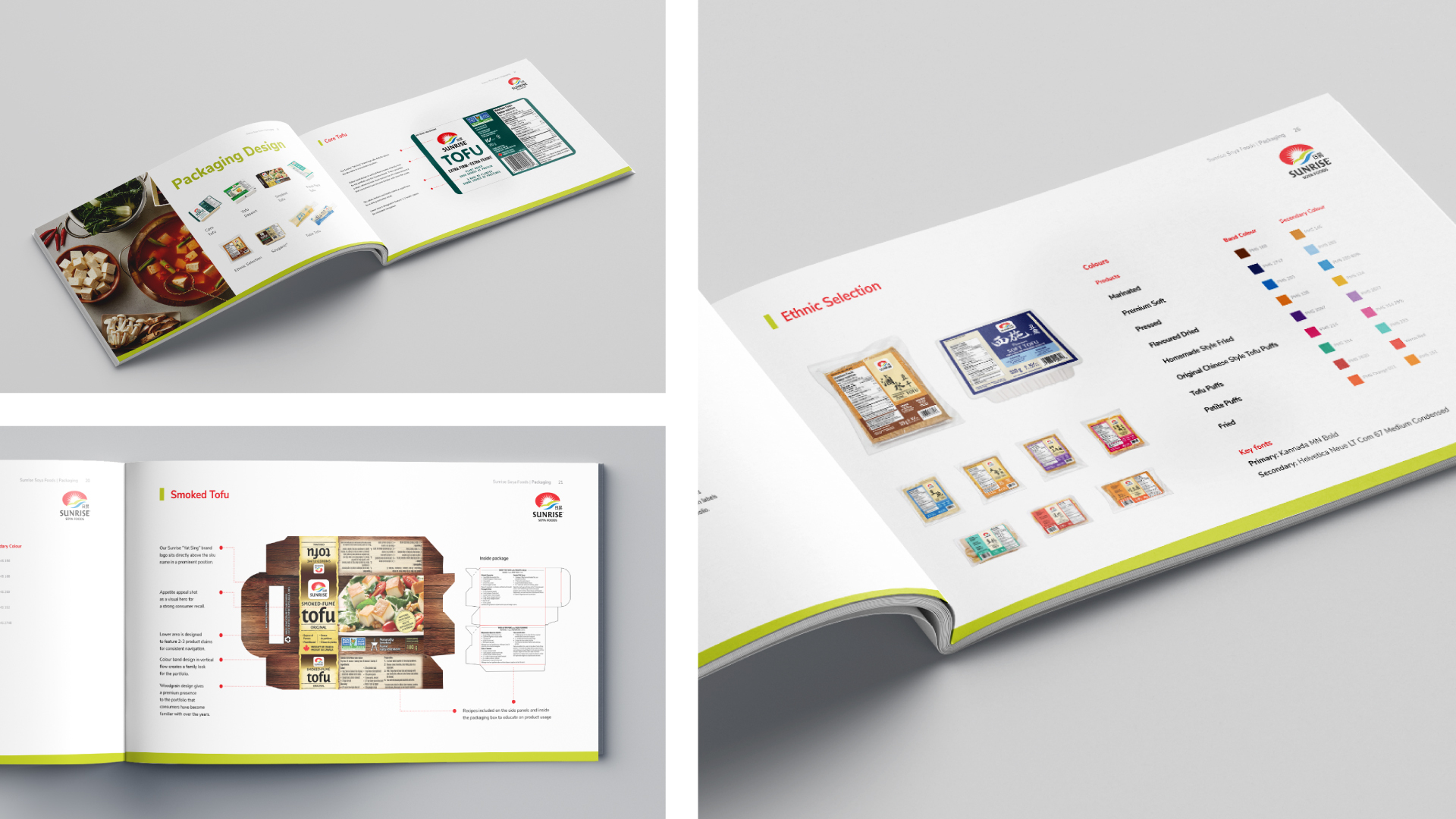
All of SSF’s products are manufactured with distinct packaging features and design nuances. Conveying these differences clearly is essential for communicating to designers how to lay out the designs so that the Sunrise Soya Foods brand is displayed distinctly to consumers.
We categorized SSF’s products into seven categories and selected key products from each category. Through the use of pointer lines to showcase each packaging design’s artwork, we emphasize the features and design concepts that stand out for each product. Additionally, we provided clear displays of the colour palettes and fonts used, ensuring consistency and offering practical guidelines for future design endeavours. These strategies not only effectively differentiate SSF’s product offerings but also enhance their brand appeal and clarity to both consumers and designers.
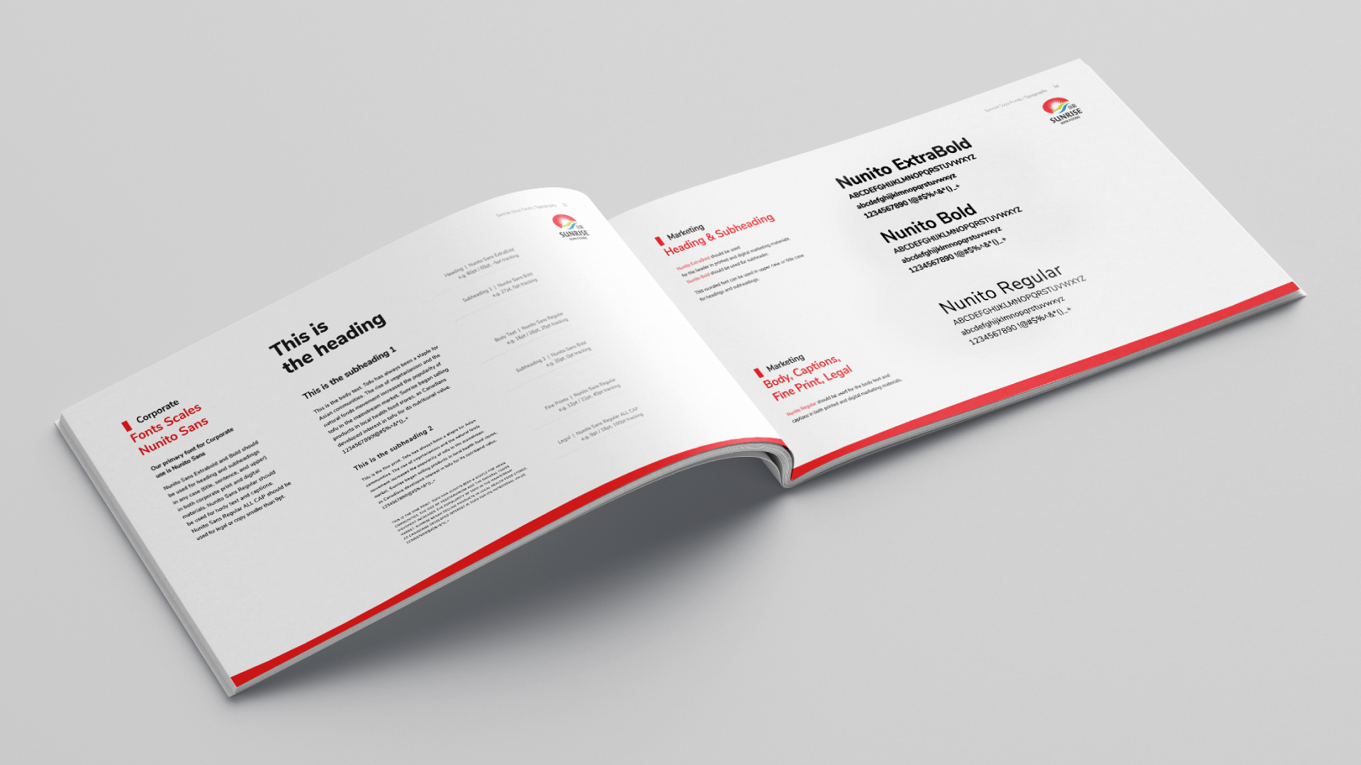
Font and Typography
The SSF brand has an extensive product line, media presence, website, and print materials and various different fonts are used. Our goal was to define specific fonts for various designs across SSF’s media to provide a more cohesive and uniform look to their brand.
We reviewed previous work to identify common typeface qualities to ensure that the new fonts would still align with existing materials.
For corporate material, we suggested using a non-rounded, sharp terminal sans serif font to project a professional image. For marketing material, we suggested using a rounded terminal sans serif font to convey friendliness.
Communication
Throughout our communications, the SSF team has been very organized and responsive with their content, providing very clear guidance in their feedback. Working with them to showcase their brand and in building this brand book, along with their many other packaging and design endeavours, has strengthened our professional relationship – the kind of working relationship we strive for. We look forward to working together on their future marketing projects!
Find out more about Sunrise Soya Foods great tofu products »
Looking to elevate your brand? Let’s talk strategy! »
Category:
Brand IdentityRelated projects